Nandos Grocery Refresh
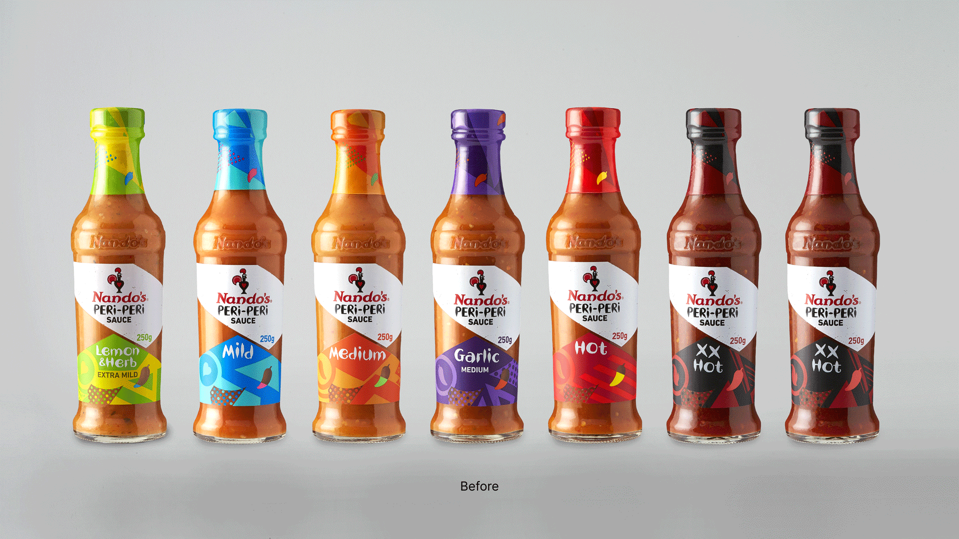
Challenge
Trends in the hot sauce category trends were leaning more towards food credibility; natural ingredient call-outs, food quality cues and cooking expertise had begun to dominate. Our job was to communicate those credentials, as well as make the packs easier to understand for shoppers who were struggling with comprehension – but without losing that young, joyful, Nando’s fire.
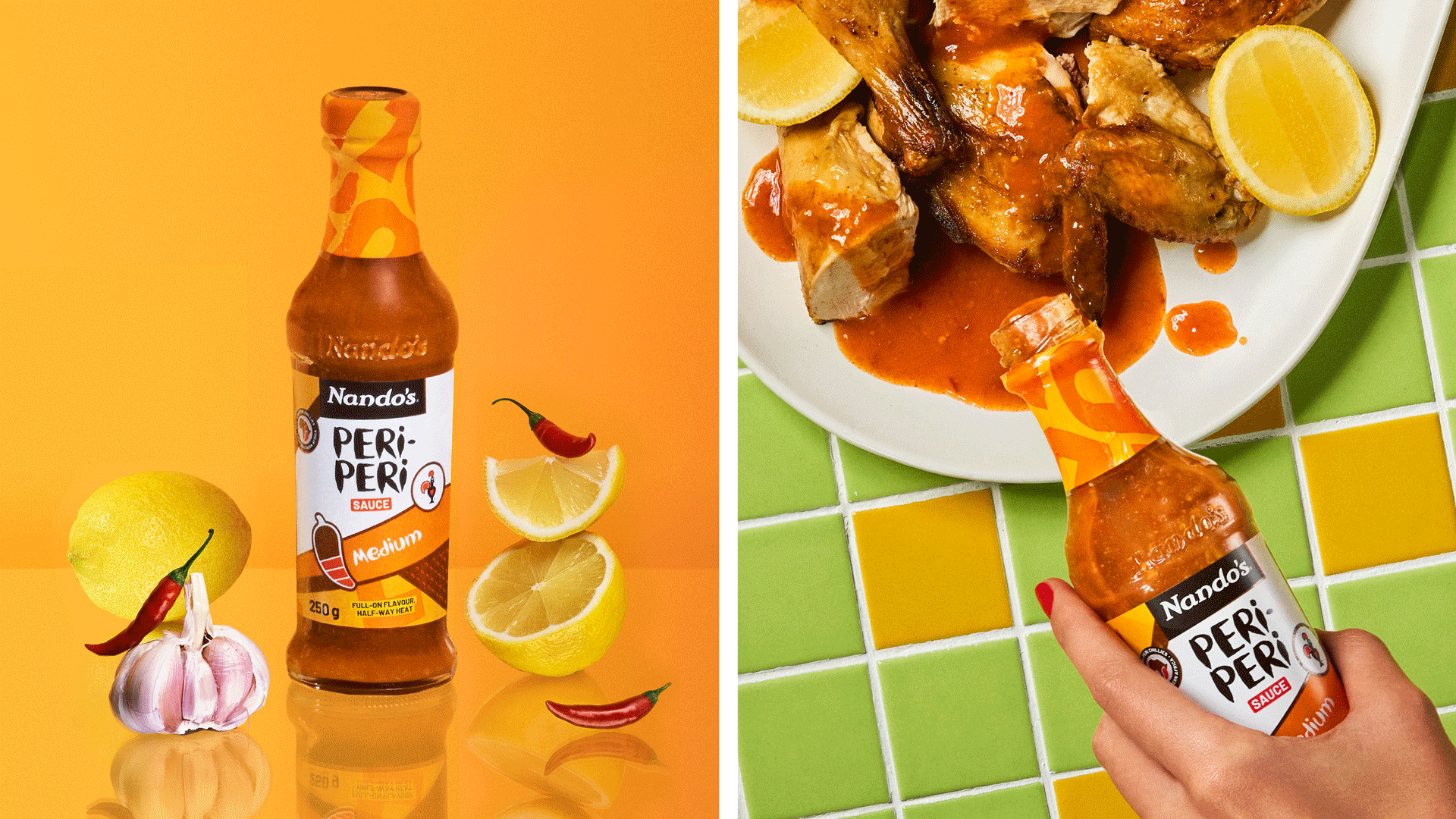
Solution
We eliminated shopper confusion by developing a clear messaging hierarchy. Amplifying Nando’s Hand, a distinct brand asset, helped us own PERi-PERi; making the heat indicator (PERi-ometer) larger and clearly showing the heat strength, led to greater comprehension around heat levels. We also designed a provenance icon, addressing both ingredient credentials and the brand’s origin story. Now, with a new PERi-PERi pattern and bold use of colour, the packs shout from the shelf – balancing category-fit functionality with Nando’s youthful, African energy.
-
Design Direction
-
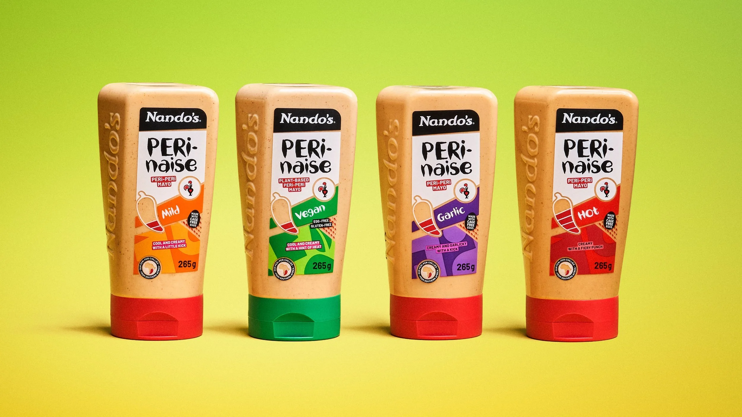
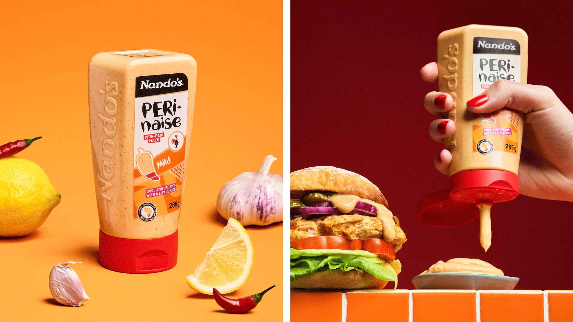
Packaging