Nedbank
Avo SuperShop
Challenge
Nedbank developed a powerful super app called Avo, but faced a common market hurdle: low consumer awareness and a limited understanding of the platform's extensive, all-in-one shopping capabilities.
Sunshinegun was brought in to establish a clear brand structure, naming strategy, and cohesive visual identity. The core strategic challenge lay in balancing Avo’s inherent playfulness and authenticity with the established credibility and trust of the Nedbank mother brand. The brief required navigating complex brand architecture and exploring varying degrees of proximity to the parent company. Avo needed to be it’s own product, but with the familiarity of the trusted Nedbank brand.
Solution
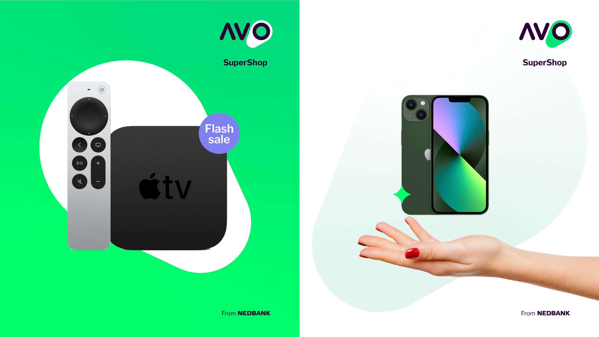
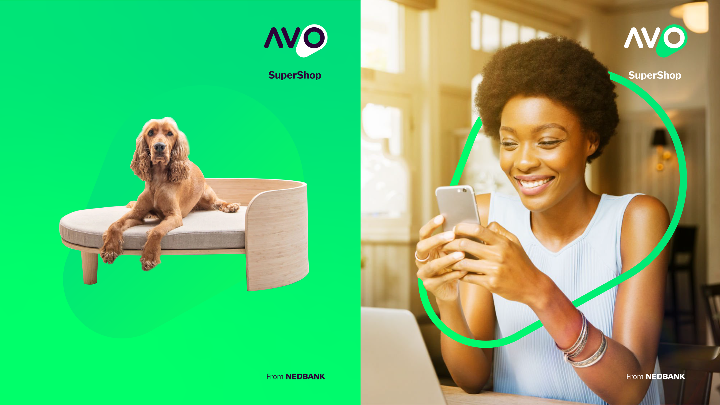
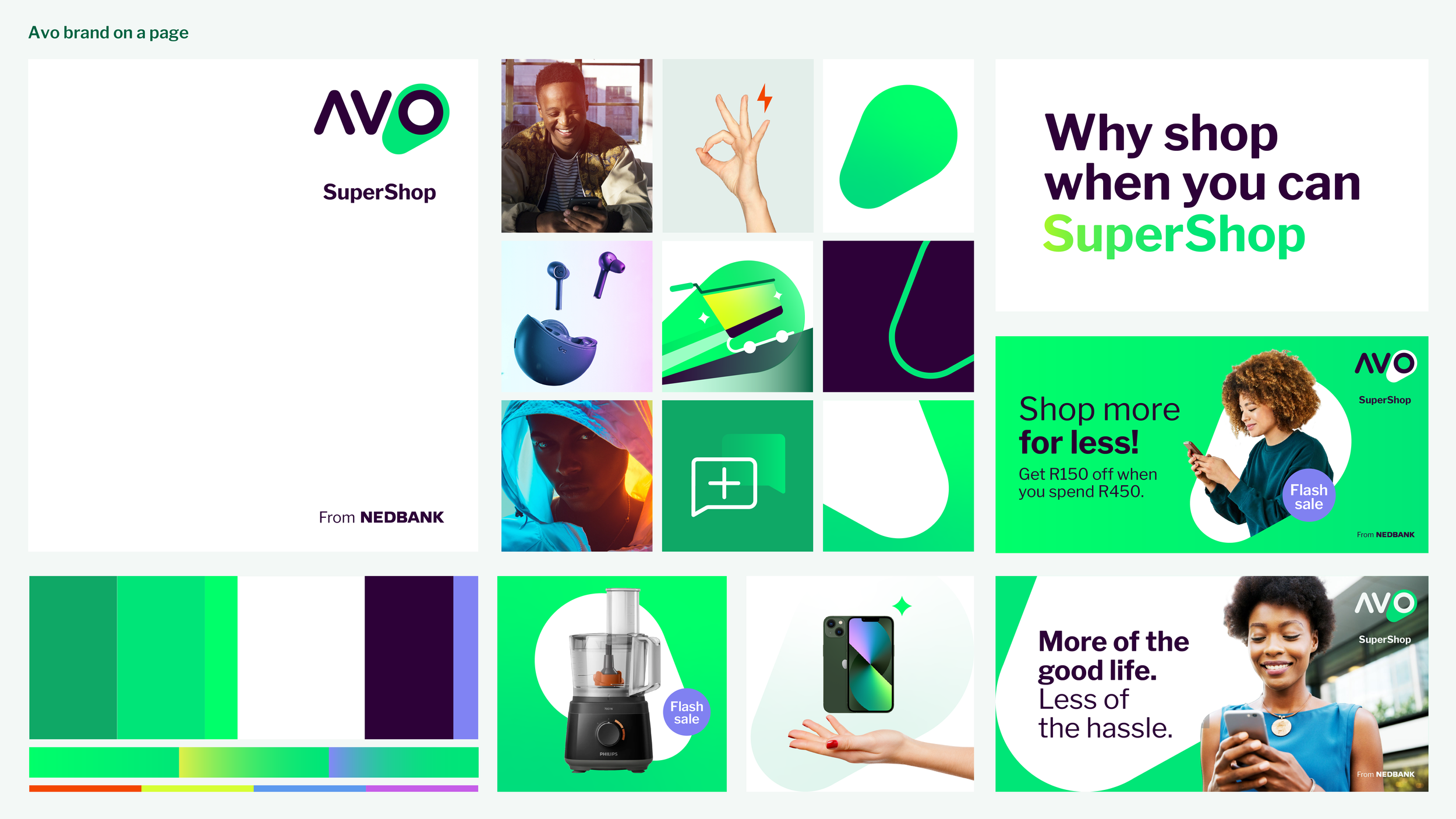
Our approach was to build a comprehensive visual identity system directly from the geometric DNA of the Avo logo itself. This provided a flexible, instantly recognisable toolkit capable of scaling across different touch-points.
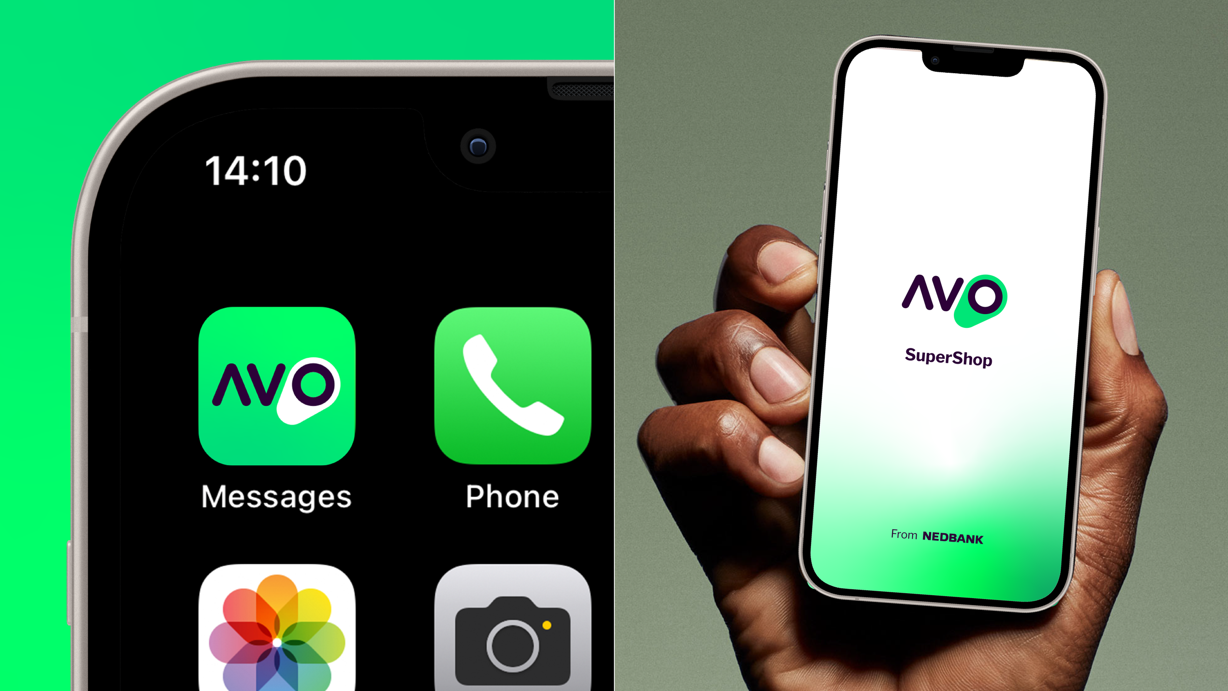
To reduce visual clutter and prevent layout overbranding, we introduced a structured "from Nedbank" dynamic lock-up that helps keep Avo as it’s own product but with the trust of the Nedbank brand. We also streamlined the photography guidelines, co-branding rules, ensuring the creative direction remained clean, distinct, and primary-color led without becoming overcomplicated. We bothered elements from the Nedbank brand asset library, but Super Charged them, to align with the Avo visual identity.
-
Design Director
-
Brand Identity, UI
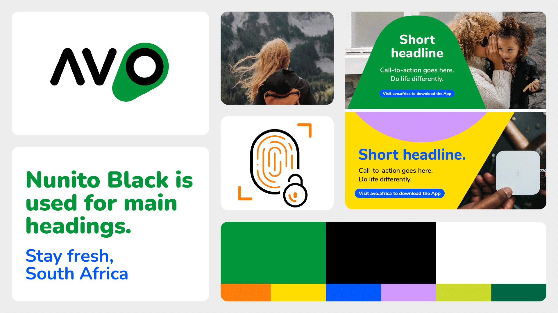
Old vs Update Visual Identity
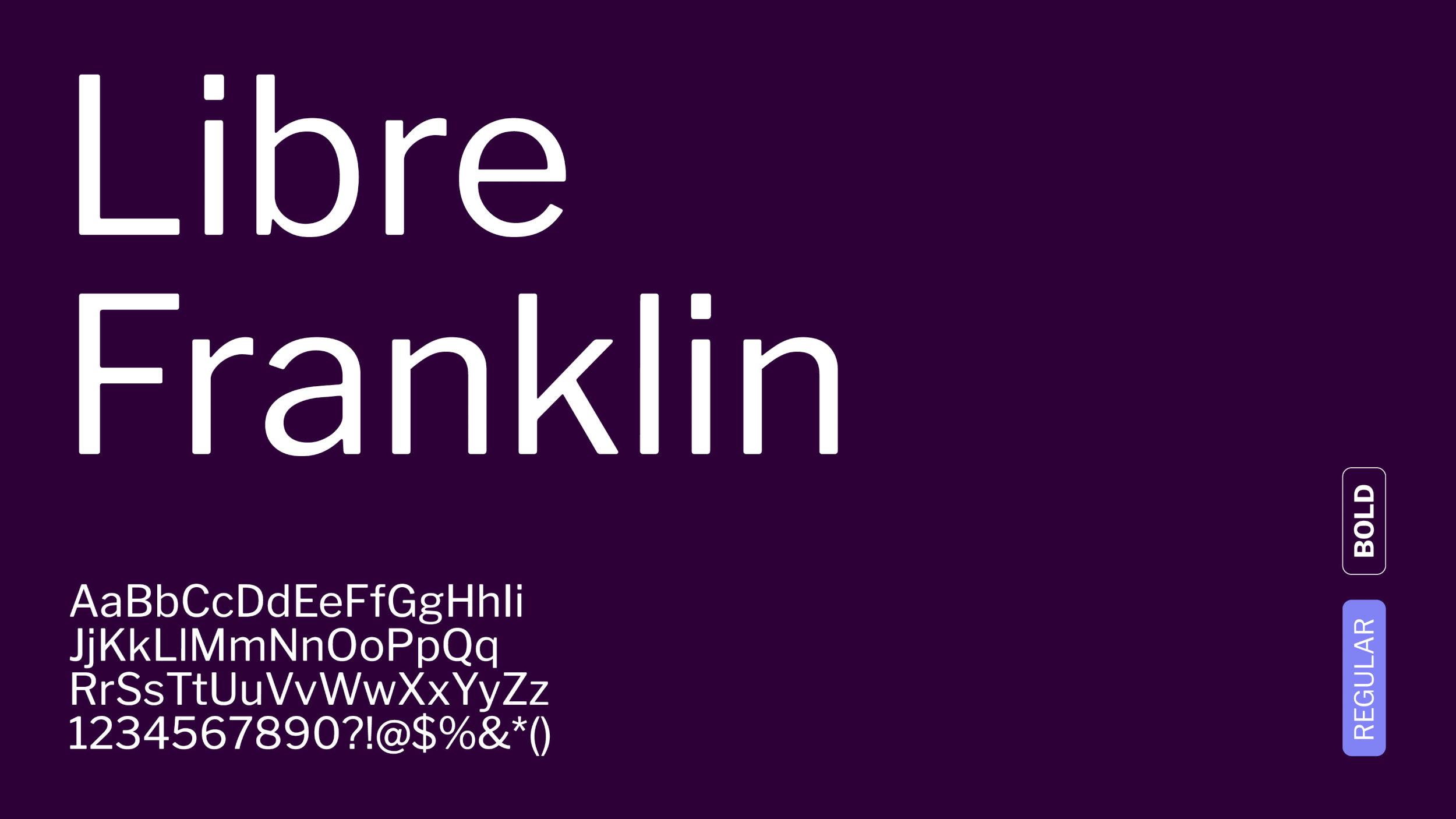
Same Font family used for Nedbank to create recognition and consistency. It is also a Google font.

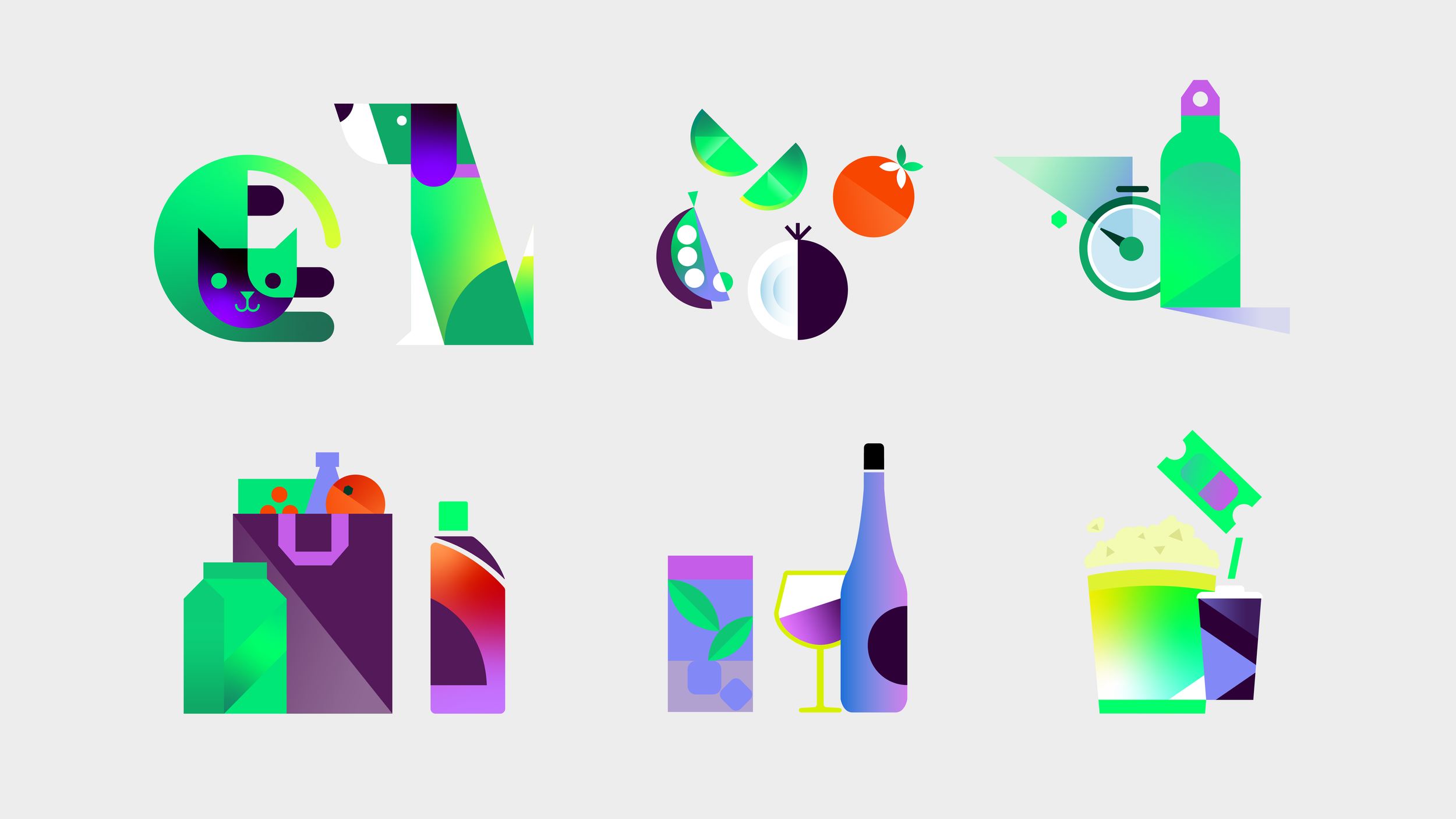

Nedbank Illustration style, but super charged.

Photography Treatment